Interpreting Supabase Grafana CPU charts
Last edited: 4/8/2026
Guide for setting up Supabase Grafana
CPU
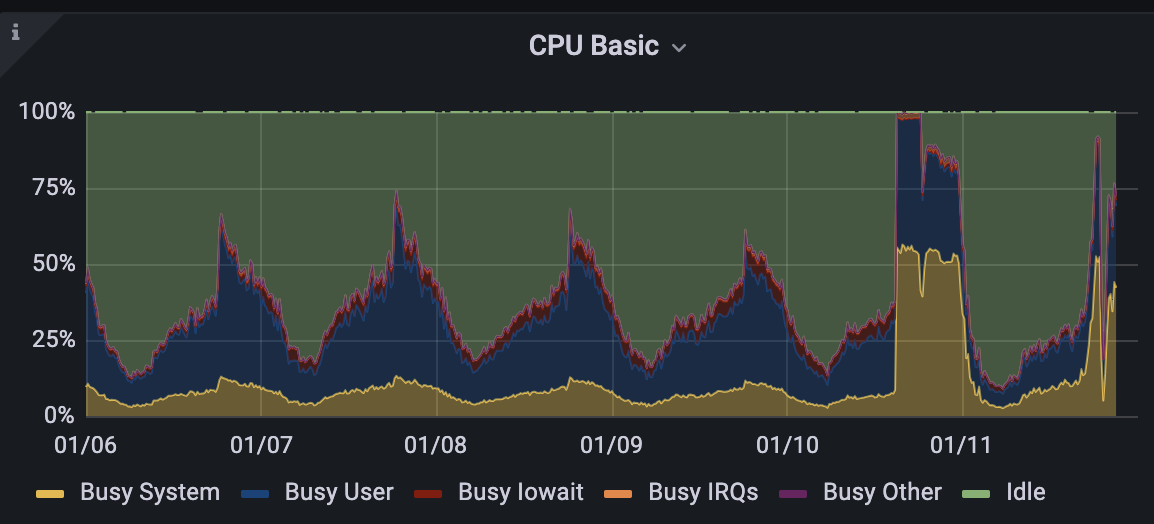
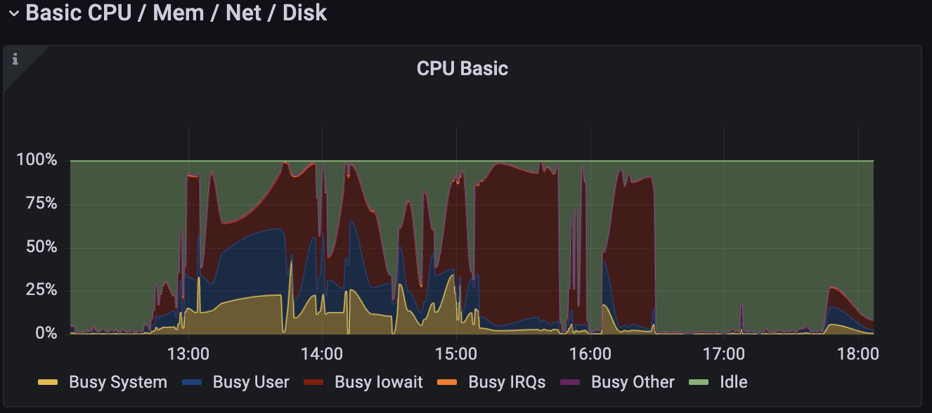
Here are examples of unhealthy CPU utilization:


The CPU chart shows 4 distinct metrics of interest:
- Yellow: It represents CPU utilized in kernel space (privileged OS operations). If this is high, it may be a sign that your app is connecting/disconnecting too aggressively. It could also be symptomatic of extension-related errors.
- Blue: It represents requests in user space and mainly reflects the CPU usage from regular queries. For optimization tips, check out the links at the end of the page.
- Red: It represents cycles the CPU spent idle because it was waiting on IO tasks. Any amount of red often implies disk or, indirectly, memory problems. The links outline how to address this type of issue.
- Green: These are CPU cycles spent idle.
As the CPU peaks towards 100%, queries and database tasks will begin to throttle, as they won't have enough time or access to the CPU.